
 Form Builder
Created by Orckestra
Form Builder User Guide
- Introduction
- Inserting New Forms
- Editing Forms
- Adding Fields to Forms
- Editing Field Properties
- Viewing submitted data
- Receiving Submitted Data by Email
- Test Your Knowledge
Adding Fields to Forms
You can add, edit and remove fields on a form in the Form Builder on the “Designer” tab.
You can simply drag and drop a field component on the form as well as rearrange the fields added already on the form.
When you select a field already added on the form, you get access to its properties where you can fine tune its appearance and behavior.
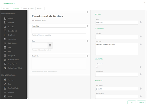
Figure 12: Adding fields to a form in the Form Builder
To add a field to the form:
- Edit the page where the form is.
- Edit the properties of the Composite.Forms.FormBuilder.Form function that stands for the form.
- On the "Designer" tab, from the "Component Library" pane, select, drag and drop a component (field) onto the middle pane. The field will appear in the middle pane, and its properties will be available on the right pane.
- Where necessary, specify the field's properties such as the name, default value etc. Please note that each component has its own set of properties. (Please see “Editing Field Properties” for more detailed information.)
- Repeat Steps 3-4 for as many fields as you need.
Note. Along with the field components, you can also use text and decoration components such as headings or separators. They are listed on the right pane under "Text & Decorations".
The components listed in the Component Library are fields of various types you can add to your form. They collect the user input by allowing users to type in, or select values on the form.
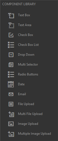
Figure 13: Component Library
Here is a list of the components available out-of-the-box in the Form Builder:
- Text Box
- Text Area
- Check Box
- Check Box List
- Drop Down
- Multi Selector
- Radio Buttons
- Date
- File Upload
- Multiple Upload
- Image Upload
- Multiple Image Upload
The text and decoration components allows you to improve the form’s appearance by headings, texts, images or separators.
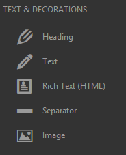
Figure 14: Text and Decorations
Unlike the field components, these components are read-only, they only display information and are not designed for collecting input.
These are the text and decoration components available in the Form Builder out-of-the-box:
- Heading
- Text
- Rich Text (HTML)
- Separator
- Image