
 Form Builder
Created by Orckestra
Form Builder User Guide
- Introduction
- Inserting New Forms
- Editing Forms
- Adding Fields to Forms
- Editing Field Properties
- Viewing submitted data
- Receiving Submitted Data by Email
- Test Your Knowledge
Editing Field Properties
You can fine-tune the field added to the form by editing its properties.
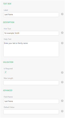
Figure 15: Text Box field properties
Most fields that allow users to input values come a number of properties such as:
- Label
- Field Name
- Help Text (the description that normally appears below the field)
- Required (the indication that the value in this field is mandatory; otherwise, the form will not be submitted)
Some fields also allows you to specify:
- the default value
- the hint text (the text that will appear within a field as a hint for an expected value)
- the maximum length
Still some fields might have specific properties. For example, list-like fields will allow you to specify list items (options), media-related fields – paths to the media files.
At minimum an input field will have the Label property which will be filled automatically when added to the form. The Field Name property will be filled automatically after the value in the Label property.
(In general, the scope of properties is defined in the corresponding Razor functions, discussed in depth in the Form Builder Developer Guide.)
Let’s have a quick overview of the most common field properties from the out-of-the-box Component Library.
To edit properties of a field:
- In the Form Builder, select the field the properties of which you want to edit.
- In the right pane, specify values you need in corresponding properties.
- Click OK to save the changes to the form fields.
The Label property identifies the field in the user-friendly manner and appear on the form usually above the field itself.
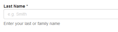
Figure 16: Label of the field on a page
It is also used identify values submitted by users in report-like views, for example, when you are browsing the submitted data.
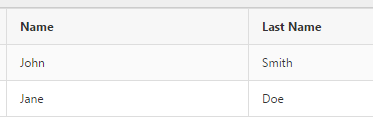
Figure 17: Labels in the submitted data view in the CMS Console
The value of the label property is used to automatically generate the value for the Field Name property.
When you add a field to the form in the Form Builder, the Label property value is generated automatically after the name of the field itself. For example, if you add a Text Box filed, the automatically generated value for the Label property will be ”Text Box”.
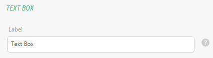
Figure 18: Default value in the Label property
But you can always replace it with your own value.
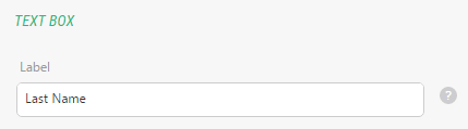
Figure 19: User-defined value in the Label property
The Field Name property is the programmatic name of the field on the form. It differs from the Label property in that it is used internally by the system, for example, when saving or retrieving data.
The Field Name property value must be unique for each field on the form.
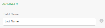
Figure 20: Field Name field property
If not specified explicitly, its value will take after the Label’s value. If you happen to have Label properties with the same value on the same form, the automatically generated Field Name’s value will get an increasing number appended to it, for example ”Text Box 1” for the second Text Box field on the form.
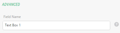
Figure 21: Auto-generated value for the Field Name property
You can always replace the automatically generated value with your own provided that it is unique on this form.
The Help Text property contains the description that helps users understand how to fill in the field.
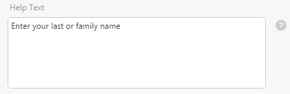
Figure 22: Help Text field property
The help text normally appears below the field on the form.
Figure 23: Help text below the field on a page
The Required property allows you to force validation on the field so that it always has a value.

Figure 24: Making a field required
If the field is left blank, the form submission will fail and it will be marked as invalid, for example, by changing the color.
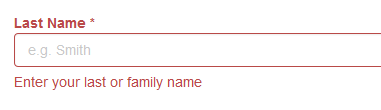
Figure 25: The field has failed validation because it requires input